Role: UX Designer
Project's Teams: Product strategy, Dev team
Client: Foundation for Intentional Community aka FIC (ic.org), which is a non-profit that has a directory of international communities to help connect people and communities
Tools: Figma, Figjam, Claude, ChatGPT, Google Gemini, Notion, Google Drive, Fontanello, Colorpick Eyedropper, GoFullPage
Project Length: 3.75 months
Key Outcomes:
Redesigned home page based on new user flow to match Google analytics data to build trust with new users
Restructured advertising page to front-load information
Redesigned search bar to focus and optimize on actions related to searching-function
UX audit in the midst of development
Client reached out requesting a UX audit of their dev website while they were in the midst of development, which posed unique challenges as the website would change daily.
Client shared that they are on a tight timeline to get the website up and running and wanted to see what bugs there currently are on the dev website. Implementing changes that are crucial for site.

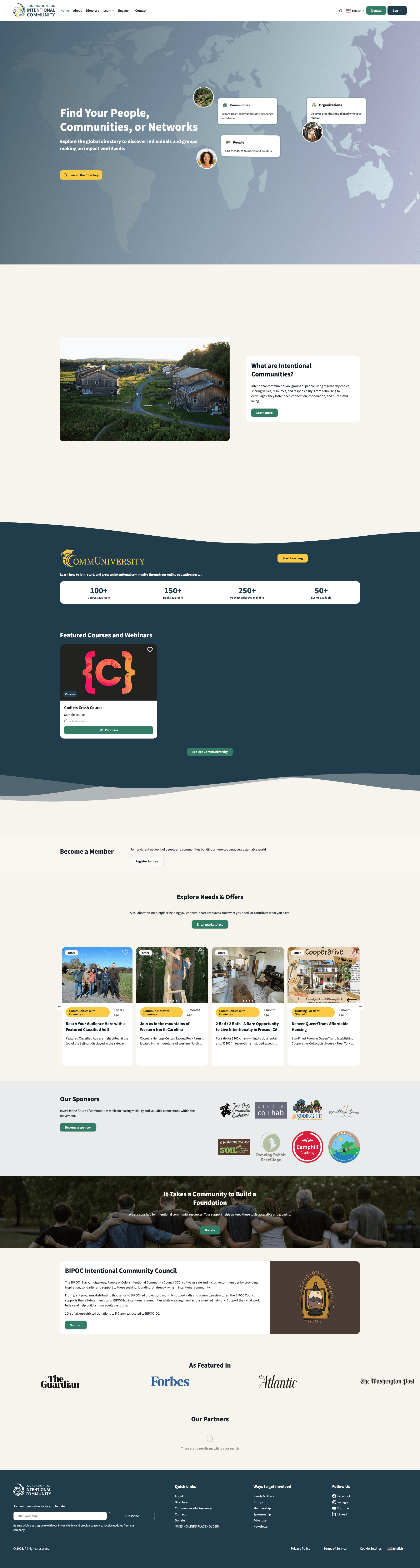
General findings
Overview of offerings: Through use of the website, there were so many offerings that users find as they use it, but recommended a high-level overview on the home page to help with navigation
Selling CTA's: One revenue flow of FIC is plus membership, which allows for more website features, but the "Become a Member" section feels lackluster in terms of educating and marketing membership.

Current "Become a Member" section on dev website
Lack of "Home" in navigation bar: Without a "Home" in navigation, there was slight friction in using the website when trying to go back to homepage that is a generally established mental model for users.
Sections: Sections blended together and recommended using colors to separate sections.
Inconsistent spacing: Areas with too little or too much white space, especially between home page sections. Buttons felt like they were floating.
Incohesive design system: Use of buttons variants were inconsistent with design system, which led to incohesive visual.

Existing "Explore Needs & Offers" section on dev website
For the first 4 months of the year of the current website, of total users, there were 20K returning users & 166K new users or 89% of users are new users.
UX research team uncovered some insights when performing usability testing on the existing version of the website and provided insights that revealed pain points.
What worked:
Research participants were drawn to "Take a Quiz" feature that would provide introduction and direction, depending on user's intent.
What didn't work:
40% of participants had difficulty trusting platform due to lack of clarity of purpose & value proposition.
Users noted absence of informative content, like personal stories or community insights, which led to lack of credibility and trust.
60% of participants were confused on specific terms/ jargon, like "Communiversity" and "Intentional Community"
80% of participants were unclear on what being a member entailed.
Website's unpolished layout eroded trust and site felt unprofessional or sketchy.

Existing section on dev website. Usability test showed there was confusion on what "intentional communities" entailed.
Quantitative social proof: For users to better understand the organization and its credibility, I created a section under the hero with quantitative social proof with numbers from the client's existing About page to showcase the client's existing reputation.
Qualitative social proof: The client originally had a news outlet logo garden section near the bottom of the homepage, so I moved the section near the top beneath the quantitative social proof.
Easy steps: Users usually want to know what to expect before they try something, so I simplified the process for new users in 3 steps.

Numbers, logos, and quick steps to be placed under the hero
Clarification & front-load additional information: Usability test showed confusion on what being a member entailed. Previously, section only asked users to become a member, but didn't add information of what being a member entailed so brainstorming with a team member, I:
Adjusted the section header from "member" to "FIC member" to reduce confusion that it is a member of a community
Added a sentence on some specific perks of being a member
Adding "Learn More" button: This added button will give users a low-pressure way to go to the membership page to learn more before committing to signing up to be a member.
Previously, the "Become a member" section had 1 sentence and a CTA, which could easily be scrolled past and left room for improvement.
Solution: I found a quote on the FIC About page of "People need community. Communities need people. People and communities meet at FIC" that I believed could be beneficial to add to the value proposition of FIC and why FIC may be beneficial of the user.
As the organization has free & premium member, through adding a "learn more" button that links to the membership page, the user through learning more about the different offerings may opt to become a paid premium member.
Current section on development website

New section with new header, tagline, Learn More button and specific perks of free membership
The website had specific jargon terms, like Communiversity as the umbrella term for their courses offering.
The goal was to introduce these jargon terms to the user and build a bridge of understanding, so the user can make a better informed decision and reduce friction or confusion and improve clarity.
Use subheader description as the section header to introduce jargon. Before and after sections can be seen below.

Current section on development website

Changed heading to "Learn About Community at Communiversity"
As "Needs & Offers" is a specific term that this organization uses that a new user may be unaware of, I used added the word "marketplace" to the header and added a sentence of what the marketplace is to help aid in understanding.
Before

Current section on development website
After

Changed header and added a sentence on some examples in the marketplace.
Participants from the usability test wanted more information on the organization & intentional communities.
With my product strategist, we combined our ideas to redesign the "What Are Intentional Communities?" section that the client had right after the hero section in the dev website.
Making more use of "What are Intentional Communities?" section:
Maximizing description: The org had a free guide to help users better understand community, so we added a CTA to download the guide. The section also has an in-text link to go to the About page to learn more about FIC.
Video to replace image: On the About page, I found an intro video on FIC and community, so I used it to replace a standstill photo as the thumbnail also provides a visual picture of the same photo.
Creating high-level overview section:
Introduction & Value proposition: Introduce offerings and address issue of showing value proposition. With so many offerings, there can be overwhelming or a chance for missed opportunities of users not knowing the potential services the org can provide.
Cards with actions: Followed the design system, and created cards with verb titles and icons to help orient the user. White buttons are click-able so users can go to their desired page.
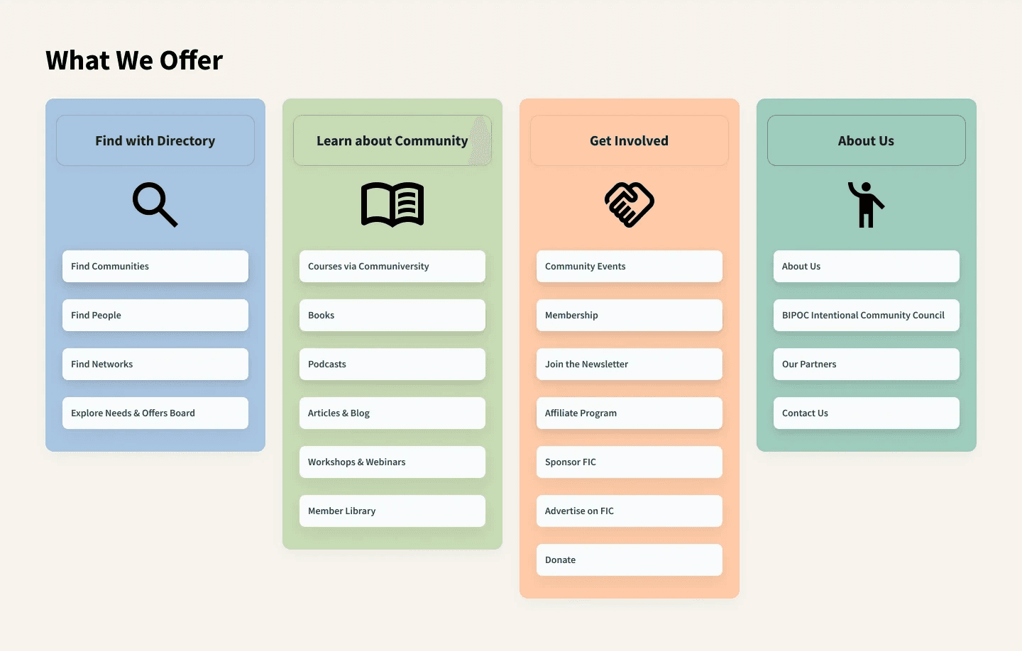
High-level overview section with cards to categorize different offerings

Dev section had a lot of under-utilized negative space on the top and bottom padding
After

Reduced padding and provided more options of learning more about the organization.
Trust built through user flow: Focus on persona of a cold, new user where trust and credibility needs to be built.
Provide social proof, personal stories/testimonials, and reputable logos in the beginning.
Trust built through aesthetic: Focus on the previously created design system for consistent sections with consistent spacing and button designs to address "sketchy" feeling.
As majority are new users, I wanted to build an experience that will take a cold user and introduce the org and its offerings and build trust.
To do this, I prompted Claude & ChatGPT to get an ideas on user flow with the following: Majority of an online directory to find communities is 8 times the amount of new users than returning users. What order of sections should I have if I were to design focusing on new users and want to establish trust and sharing information?
Hero & value proposition
Social proof & trust signals (ex. credibility, logos)
How it works
Guided discovery (ex. short quiz)
Featured/ curated communities for window shopping
Community spotlight
Sign up/ Join CTA

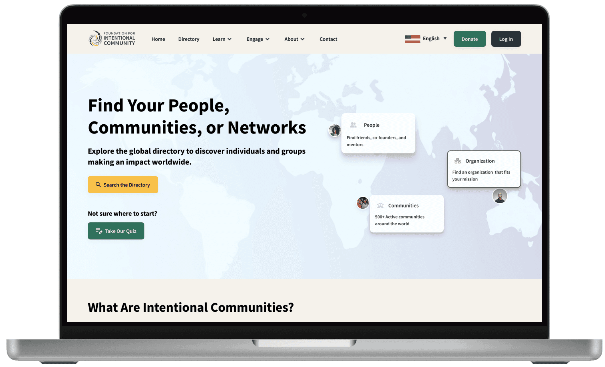
Adding "Not sure where to start?" with the discovery quiz button CTA & adding "Home" to navigation bar.
Introduce & orient user:
Discovery quiz in hero: Added discovery quiz in hero to catch a new users eye and provide a guided path to orient them to the website and provide direction to what they are seeking.
Provide easy steps at a glance of how the website works.
Added a "What We Offer" section with all the offerings to provide better understanding of how the website can serve the user and what the organization is.
Front load social proof to built trust: Added years of service & other numeric stats to create trust. Brought "As Featured In" news outlet logo garden from the bottom to the top to share recognizable, household names.
Humanize with examples: Created a diverse selection of featured communities. And created a community spotlight of an FIC member with a testimonial taken from the donation page.

Created "Community Spotlight" section in home page to humanize organization with testimony
Hero
What are Intentional Communities?
Communiversity (Course offering)
Become a member
Explore Needs & Offers
Our Sponsors
Donate
BIPOC Intentional Community Council
As Featured In (Logo garden of news outlet articles)
Our Partners
Footer
Proposed user flow
Hero (adding discovery quiz CTA)
Social proof (numeric achievements)
As Featured In (Logo garden of news outlet articles)
How it works
Featured communities
Community spotlight
What we offer (overview of all offerings)
Become a member
Communiversity (Course offering)
Explore Needs & Offers
Donate
BIPOC Intentional Community Council
Our Partners
Footer

After showing the design and the data research behind the new user flow and sections, the client relayed how different internal teams have made sure certain sections stay at certain spots, like how "What are Intentional Communities?" should stay under the hero. And the "Communiversity" section should stay near the top of the homepage.
Client sees value in high-level overview offerings section, but reminds him of their navigation bar.
Believed the logo garden of news outlets was doing too much as the qualitative numbers already provided social proof.


After presenting redesigns to client, client will be presenting designs to internal team to scope what changes are feasible and are priority for this sprint versus later website updates. As of writing this case study, the internal review is still occurring.
My original proposal was focused on users where the user flow was designed for new users, but hearing the feedback from the client of how certain revenue-generating sections have to be higher up. I tried to find a balance for the user flow between business goals & user needs
As the client had a very busy schedule and meetings were limited, I tried to anticipate potential designs through themes they mentioned in prior meetings to present in future meetings to make the most out of the time and provide options and feedback direction for future redesigns.