
Role: Graphic Designer
Client: Muni (aka San Francisco Municipal Transportation Agency or SFMTA)
Key Outcomes: Designed & proposed new graphic design and new logo merch ideas to Muni
Tools: Figma, Procreate
Project Length: 2 weeks
Saw a video of LED artwork of the New York City's public transportation map with each stop as an LED light. And was inspired of how the transit lines were mapped out and viewed through the lens of artwork of the design of the transit systems.
Inspiration was also taken from line art where it is usually simple line strokes to create an image or some minimalism line art that uses minimal lines or 1 singular continuous line to capture the essence of a subject.
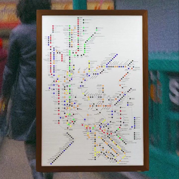
"NYC Metroboard" by The Design Rules Company
Growing up in San Francisco, I would hear that because of Muni, the majority of San Franciscans will not need to walk more than 2-3 blocks to get to their destination.
And looking at the Muni map, one could see how the lines sprawl across the city like veins, interconnected with one another. And it shows how it connects the city of San Francisco.

To achieve an accurate representation of the city of San Francisco and the Muni transit lines, I imported the Muni transit map into Procreate on an iPad and added a layer on top to hand-trace the San Francisco city perimeter and the various Muni service lines.
Hand-tracing: The little imperfections of hand-tracing add to the human element of Muni and how it serves the city of San Francisco in transporting and connecting people.
Red color: Used the muni logo's red color as the color of the service lines as Muni is providing the service.
Color of San Francisco perimeter: Wanted to keep the color neutral to contrast against whichever background the graphic is placed on top of, but allow the red service lines to stand out.
Logo placement: Logo is placed bottom right beneath the map, which is similar to an artist signing off on their work or in this case, Muni is signing off on the service they provide as displayed by the red service lines. Map has the focus, but logo is still prominent.

