

Role: Product designer, UX researcher
Client: This is a personal project, working off of prior existing UX research and product strategy work with the client, The Lupie Fam. I will address the org as “client” for this case study.
Tools: Figma, Figjam, Claude (Sonnet 4.6), ChatGPT, Google Gemini, Notion, Google Drive, Fontanello, Colorpick Eyedropper, GoFullPage
Project Length: 3 weeks
The Lupie Fam
The Lupie Fam is a non-profit organization that provides support and empowers individuals with Lupus by providing a support network and informal meetups, medical micro-grants, care packages, and wellness partnerships. Existing website is 1 page.
Goal: The Lupie Fam wanted to do a revamp and launch a new website with new offerings in the form of an MVP (minimum viable product) in order to receive seed funding to expand
Prior partnership with The Lupie Fam
To achieve this goal, a team previously partnered with The Lupie Fam in Phase 1 of the project to perform an initial phase of the project, conducting only UX research and product strategy work
Personal Project Origin
After taking a look at their website and learning more about lupus, I was intrigued and wanted to challenge myself and see how I would approach designing the MVP given:
the client’s goals and needs
prior UX research and product strategy work
designing around lupus symptoms
Phase 1 did not have a design team, so I would be starting from scratch for the MVP while drawing inspiration from the existing website’s design.
Client Intake
Client’s short term goal: Build MVP to validate with real users and use to fundraise, looking to participate in a seed round
Client’s short term goal: Create cohesive platform that provides emotional support, practical resources, and ability to track health journey for people newly diagnosed with lupus, people living with lupus, caregivers, and organizational community sponsors
Client Requirements
Mobile-first design: Design needs to work on mobile-first as most of lupus community is on their phone, then think about desktop design afterwards.
Accessible for people with lupus: Accessibility is high priority as there are different levels of tech savviness. People with lupus can have cognitive challenges during flares & visual issues, so clear, accessible design is important.

I perused the client’s existing website & social media accounts (Facebook, LinkedIn, Instagram) to better understand their current design decisions and draw inspiration.
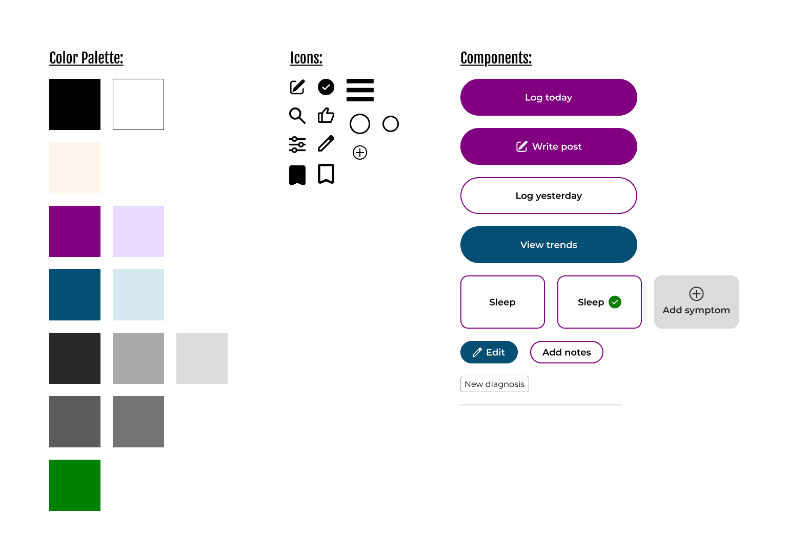
After review, I created a mood board of their logo and social media posts for inspiration and understanding how they use their fonts and colors.
Colors: the posts have colors from the existing logo with a light peach being the background and a lot of usage of purple and the teal blue.
The posts are informative, easy to digest, welcoming, and whimsical.

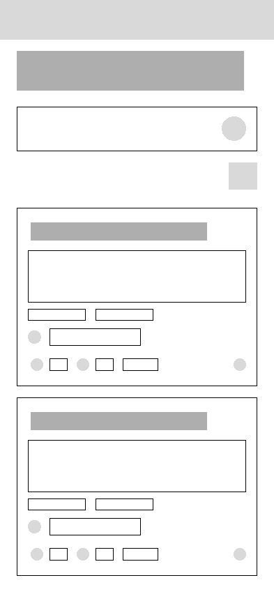
Here are some early wireframes of the following screens:
Screen to select date to log symptoms or view symptom trends
Symptom menu
Community forum


Typescale is based off of the fonts in the existing website where headers are in Fjalla One and copy is in Montserrat.
Through research, I found a common lupus symptom is eyestrain and blurry vision, so I used ChatGPT to develop a mobile typescale that focuses on larger contrast & with body copy at 18px as larger fonts for easier readability.
According to Lupus Research Alliance, 90% of people with lupus are women. And due to lupus symptoms, like eye strain and mobility issues, I concluded users may opt for a larger screen size.
I decided to design for the iPhone 16 as I found the average phone size for women in about the size of an iPhone 16, which is also larger of the smallest phone size offerings.

I followed the colors the client currently used in their brand system through their website and social media posts. I kept purple as the primary color as it is the official color for lupus and I saw the use of blue as a secondary color.
As the purple is a bit brighter and warmer, I deviated from the blue that was used and made a shade of blue that was cooler to help with contrast to the primary color and making sure it had an accessible color contrast with white.
Following the org's current use of colors, I decided to keep the light peach tone as the background color.
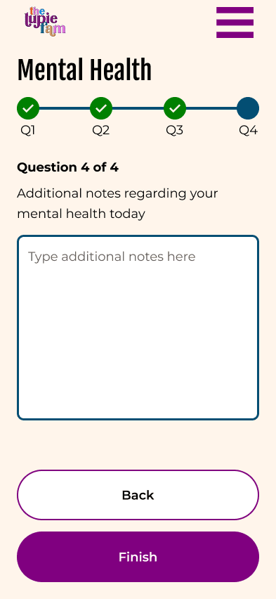
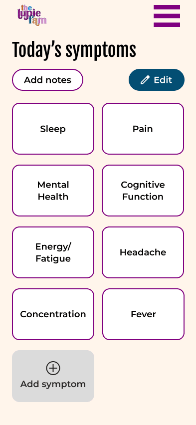
To design around fatigue, I wanted to help reduce cognitive load and reduce decisions, so I aimed to design a simple interface with easy to spot CTA's. For example, for symptom tracking surveys, I added 1 question per screen that would automatically pre-save progress.
Reduce options: For each scale to capture symptoms, I opted for the Likert scale (5-answer option) to have a simple way to distinguish answers while capturing degree of symptoms.
Quick seeking: Larger square buttons with less items in 1 screen where users could quickly find the symptom they wanted to log (larger square buttons inspired by AirBnb's listing page)

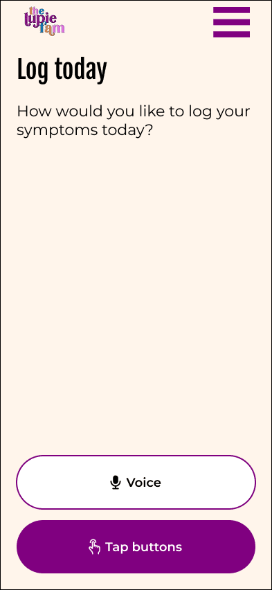
I aimed to match the user's energy levels and making sure to capture the most important details. For example, if a user had a symptom flare and had extreme fatigue, I tried to match it with simple surveys & the ability to use AI voice-assistant to navigate & answer symptom-tracking questions.
Giving users options: If a user had more energy, I made sure that there were options to add notes or additional details. If a person wanted to add general notes for a day and later fill out the specific survey questions or add more notes about a specific symptom, they are able to do so.
Retroactively log symptoms: Some days may be better than others, so I wanted to add quick option buttons log symptoms for yesterday or a custom day for when a person may have more energy to go back to retroactively log symptoms.
Mobility Issues
For people with lupus, mobility issues is one major concern as inflammation can cause arthritis and muscle weakness.
When doing research, I watched YouTube videos where a woman with lupus had hand shakiness and was unable to draw a straight line for her eyeliner and had to ask her grandfather to help her squeeze a lime for a recipe. Some aspects to consider for the design is designing around shaky hands and a weaker grip where each movement may be a struggle.
Designing around mobility issues
Button size & spacing: I followed WCAG accessibility guidelines as a reference where all buttons were at least 44x44px and with adequae spacing between buttons for a larger press-able target, creating more ease for the user. This can be seen with the hamburger menu.
Using AI voice assistant: For possible hand weakness, I saw how an AI voice assistant as an alternative navigation tool could help with responding to symptom surveys.
Vertical layout: When researching which survey layouts are best for users with mobility issues, I saw it was best to use a vertical layout for survey responses, which is reflected in the symptom survey questions.
Thumb zone: I also made sure to keep in mind that when designing for mobile users with limited mobility, I tried to keep CTA's and other buttons in the thumb zone, so users do not have to utilize 2 hands when using the app.
Customize to user's symptoms: There are 4 different types of lupus and within the different types there are different symptoms a person can be exhibiting. As a result, I wanted to make the symptom menu & symptom tiles customizable.
Customize symptom menu: Users are welcome to add and remove symptom tiles in their symptom menu. In addition, they can change the ordering of tiles to better suit their needs, like their most frequently experienced symptom. In addition, they will be able to view trends to present to their medical team as inspired by Conquer Lupus' lupus tracker.
Competitive analysis: The current base symptoms displayed on the symptom menu are symptoms I found while research online and researching other lupus symptom trackers and what symptoms they track. In the research, I used Google Gemini and reviewed symptom trackers from Conquer Lupus (University of Michigan) and Lupus Foundation of America.
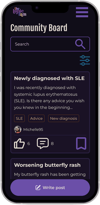
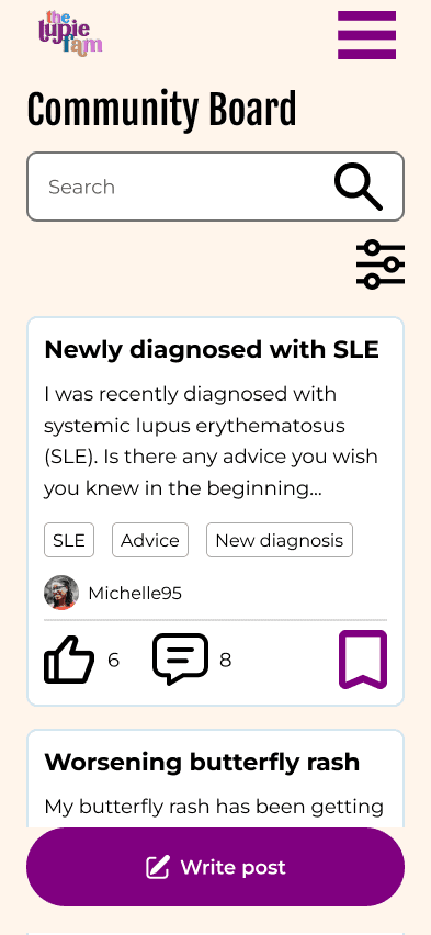
Tags: As there are different types of lupus and many different types of symptoms, I wanted to create a tagging system that will help users' post find the right people and help people search for what they are looking for, such as type of lupus, new diagnosis, if they are seeking advice or support, etc..
When creating the community messaging board, I took inspiration from existing community forums and existing illness/symptom-specific community forums, such as Reddit, Patients Like Me, and Concussion Fix.
As another common lupus symptom is eye strain and eye fatigue, I wanted to make sure feedback was not just through color, but also through writing.
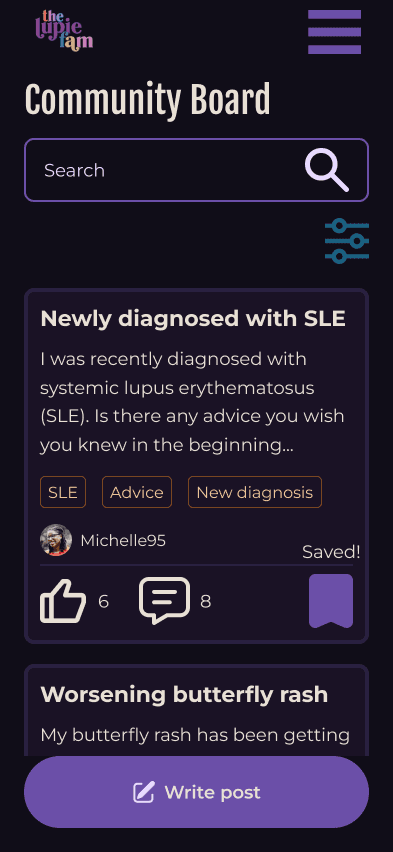
Symptom tracker feedback: One example is sceen during filling out the symptom tracker where there is a visual progress bar and written that the user, is on "Question 1 of 4". The visual progress bar indicates where the user is within the question survey with a solid dark circle indicating and un-filled circles with questions to be answered. There is also a green checkmark to distinguish the completed questions.
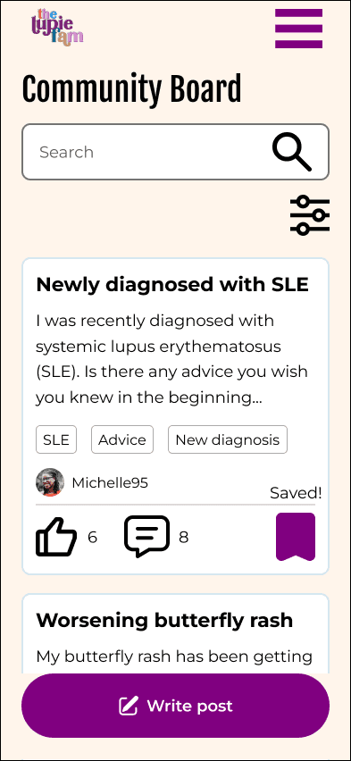
Community forum save feature: When users bookmark certain posts that they want to save and revisit in the feature, I was inspired by Beli's (and various apps') bookmarking feature where an outline of a bookmark becomes a solid-colored bookmark after saving. In addition, there is text of "Saved!" that appears for a few seconds to notify user of completion of task.
Through my research, I would peruse through reddit's lupus subreddits, reading and learning more about their symptoms or getting advice.
One post caught my eye where for people where people with lupus would mention their light sensitivity or photosensitivity (UV light) where bright lights made them feel worse. I saw there were people recommending using dark mode, turning the brightness of their phone down, or wearing sunglasses indoors. In general, they mentioned how it wasn't dark mode, but lower contrast that was the most helpful.
Combining these user stories, I went to ChatGPT and Claude to help generate a new color palette that was dark mode and lower contrast specifically for users with lupus that met at least WCAG AA standards while taking inspiration from the existing client's colors.
AI prompt: Create low contrast color palette with focus on dark mode mobile design for users with lupus that meets minimum WCAG standards for accessibility. Main color is hex code 800080 (feel free to adjust this color to help with low contrast while still meeting WCAG standards) Some other colors include E58FE3, 0081AA, D6A677, FF7E41, FFF5EB, 16AEFA, 000000. Feel free to use or not use these colors or adjust them accordingly for a cohesive color palette
In the end, I tested ChatGPT's colors and saw they did not pass WCAG AA standards despite prompting again for WCAG AA standards. I decided to play with Claude's color palette as the dark mode, low contrast color palette and see what it would look like and adjust if needed.
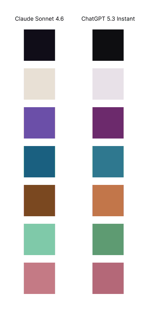

While a new dark & lower contrast mode was created, both color palettes could both be offerings and the user can decide which mode works best for them as not everybody with lupus experiences photosensitivity.


I have previously used AI for copy for buttons or rephrasing copy, but at this point in time, it had gotten to the point where it is more robust. This is the first time that I have generated color palettes from it, but at this point in time, there were still some bugs as ChatGPT stated something was WCAG AA compliant, but was not when checked.
This is the first time I designed within constraints that were related to potential users' medical symptoms, so my process was a bit different of doing a deep dive and learning about lupus, researching the most common symptoms, and researching and brainstorming the corresponding options to design around it.
This process included trying to find more personal stories and examples of what life is like for someone living with lupus, which is where Reddit and YouTube came in handy to understand someone's daily experience, which led to the creation of a dark & low contrast mode for users with light sensitivity or photosensitivity.
